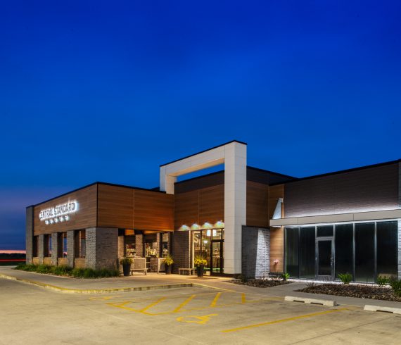
A machine for working. The rural landscape in Iowa is a tapestry of moving and fixed machines in an orchestrated concert of the perceivable drone of hums and growls necessitated by the production of crops and crop derived goods. This small building is a part of that tapestry and the design was an intentional homage to its place and purpose. It is quiet, yet part of the ensemble. The structure is sited in a field, a corner of the “section” eased to make way for another barn. The orientation is intentionally speaking to the Cartesian grid of the agrarian lands beyond rather than the machinery of the plant it serves which, is aligned with the railroad. The resolute grid of Iowa agriculture is respected. The parti is organized from commerce to production. The plan is a double loaded corridor from end to end with the serene view of row crops as the focus of one end and the doorway for truck drivers to enter to pick up “load checks” at the other. The building is a dichotomy of a poetic narrative overlayed with its function. Form follows function. With a wink. The materials of the building are simple. All are […]
Read More
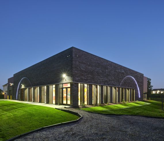
Dobson Pipe Organ Builders were displaced from their shops and offices on June 15, 2021, by a devastating fire. The fire precipitously changed the texture of the square in the small community. The replacement was intended to represent the craft of organ building…not just a metal building. The structure is predominately shop and storage space. The principal programmatic requirements were high ceilings and flexible, open space. The program seemed at odds with the town square site and the intended narrative of craft. Budget was not flexible. The narrative needed to be written with fewer words…a haiku. A typical structure with limited words to give meaning in just three lines… Contrary to the original beliefs regarding epitomes of craft, the building is grounded in a common metal frame placed on a uniform grid, which is line #1. It is foremost economical. The scale is inherently larger than anything else on the square, because most neighboring buildings come from a past that had a different scale. The mass is quieted with color…black. It recedes and remains quiet despite the unfamiliar size. The entry is line #2. The corner entry ties the building to the square with the reaching canopy and the material […]
Read More
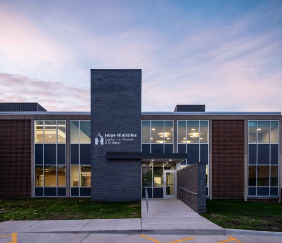
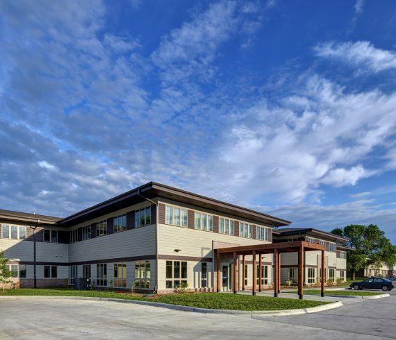
Women and Childrens Center The Women’s and Children’s Center is a story of community needs, team synergy, and an old school building. The Douglas Elementary building from 1965 helped make this project feasible; with good bones and existing interior programing that lent itself to the educational and client support spaces required by Hope Ministries. Its iconic mid-century concrete structure became the centerpiece of the interior design. Care was taken to thoughtfully design the MEP systems around this exposed structure to maintain the purity of the rhythm. Walls, plumbing, and electrical systems were selectively adapted for economy. With the existing 2nd floor programming remaining almost completely original at the classrooms. The exterior followed this approach, with only curtain wall systems and the roof membrane being replaced. An addition was made off the west end of the building to meet the flexibility needed for the living areas and another off the north – for the elevator and facility introduction. Materials and finishes were selected to create a calming residential environment and nod to the Hope Ministries color palette. The Women and Children’s Center is a self-contained community for career readiness training, practical life skills classes, educational opportunities and more. All organized […]
Read More
The design begins with a sketch by one of the clients. It is a plan. A sock shape that has three distinct parts: a foot, a heel and a leg. This sketch represents the areas of software development (foot), business functions (leg) and the common areas of shared ideas and culture (heel). The sketch would represent to basis of all design decisions. The building begins with its users; a technology company producing and selling software to universities for on-line course catalogs - the most successful and prolific company of its kind. With a steady forecast of growth, the company seeks a headquarters that will support their business activities and reinforce and celebrate their culture. The company is led by a dynamic trio of technology savvy entrepreneurs who have an affinity for a partially wooded site, a respect for the individuals they employ and a pride in who they have become. The building is an extrusion of this parti. The form emphasizes the importance of the software developers (devs) through the inclusion of a foil that delineates where the building “becomes” theirs. The foil is literally a metallic insertion that is read from outside to inside. The building changes languages from […]
Read More
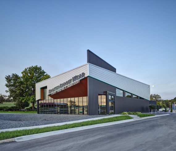
Acutely angled, metal-clad forms on a building exterior express Broken Arrow Wear LLC’s branding and company culture. The T-shirt printing and embroidery business was created with an addition to, and retrofit of, a former fast-food restaurant. The structure remains simple, a continuation of a humble wood frame. The envelope is a combination of new and existing, but the form is a derivation of the company’s name: Broken Arrow. The street façade is an exclusive conveyed through an amalgam of angles with conspicuous breaks. The angular planes are fashioned from curtainwall, stainless steel shingles and metal panels. Location: Des Moines, IA Program: Commercial Area: 5,628 SF Photo Credits: Cameron Campbell - Integrated Studio
Read More
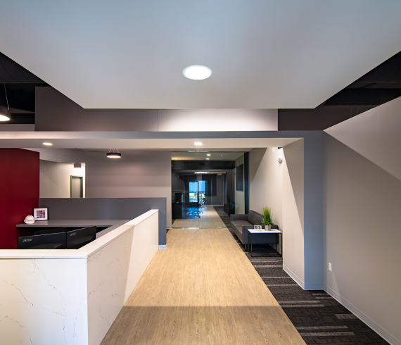
The office design for a construction company began with diagrams of an organization. The process and pace of the office space was to be organized with the same care that a construction site demands. The program was developed with the need to improve efficiency through enabling team work in both active and passive settings. The materials and compositions are to highlight a care to craftsmanship, a trait now serving the realization of design at Koester. Location: Grimes, IowaProgram: CommercialArea: 14,948 SFClient: Koester ConstructionPhoto Credits: Joseph Kastner
Read More
The Cove at KettlestoneThis building serves as a quiet backdrop; a simple building for a simple program. Each element exists because it is significant. Doors are camouflaged to simplify the structure’s presentation. Parapets are merely as tall as needed to adequately weatherproof. A screen to hide coolers is only a screen. An awning to house signage is just that. A pallet of four complementary materials selected for commodity and durability serve as an unassuming canvas.In general, the retail center has come to define the shopping experience of Iowans. These other so called ‘strip-malls’ have become ubiquitous to the milieu of the mid-west. However, this project’s subdued presence makes it stand out. Location: Waukee, IowaProgram: CommercialArea: 15,920 Sq FtClient: Build to SuitPhoto Credits: Joseph Kastner
Read More
This project was developed to create a new showroom for Rainbow Play Systems in the Des Moines area. Masonry was selected for its durability in providing a backdrop to the playgrounds and colors contained within the building. The building is as exuberant as the play areas it contains but in a way that only a building can be. This character is created using brick’s stacked construction method; courses were offset 3⁄4” to create a texture without changing materials. The owner was required to meet stringent aesthetic ordinances that required durable exterior materials and variation of the form of the face. The design met this challenge by using brick with offset patterns and split face concrete masonry units to break up the large profile of the building. This design used brick because it does not require additional finishes meaning that it will not release toxins such as VOCs into the atmosphere. It’s durability is inherent, not applied. Location: Grimes, IowaProgram: CommercialArea: 11,531 Sq FtClient: Rainbow of IowaPhoto Credits: Cameron Campbell Integrated Studio
Read More
The new home for Community and Family Resources is the result of a five-year partnership that began with programming and site selection and culminated in making architecture that’s serves to heal. The building brings together programs previously housed in three separate facilities. CFR charged the design team with allowing them to better serve their clients, while being more efficient due to the constant struggle of limited funds. The design is based on achieving a residential scale and feel in a building that is much larger than the neighboring single family and multifamily residences in the neighborhood. The plan uses wings to break the roof line into smaller scale elements while the wings allow for security and privacy between disparate program elements of children’s zone, female zone, male zone and flexible orientation zone. The roof is a familiar shingled pitch in a hip shape. The hip allowed the implementation of prairie elements in the fenestration pattern and deep overhangs for the texture of shadows and sun control for energy efficiency.The connect wings result in campus which includes housing components, office space, community meeting spaces. The campus aids CFR in caring for “One Life at a Time”, “One Day at a Time”. […]
Read More